TELUS Product Pages
As projects go, I call this one my greatest failure. It taught me a lot about stakeholder management and how to conduct successful usability studies.
My Role
For this project I lead the redesign, user experience and evolution of the product pages – named project Herman.
Customer Insights & Ideation
Paired with a great squad consisting of a product owner, design intern, scrum master, QA tester and 2 developers, I mapped the user experience concept with features that address customer behaviors and buying motivations.
Experience Strategy & Vision
I strategically created frameworks and prototypes to share the vision and design principles. We used usertesting.com to gain insights into the new design to validate any idea we had about the new flow.
Planning & Scope Definition
After getting a clear idea about the product, the Product owner, Scrum master and myself worked with the developers to help breakdown the design in small workable stories for development.
Oversight & Coordination
Through cross collaborative sketch sessions with other designers, developers and product owners we gathered great perspectives from people outside of our squad.
Design Execution & Validation
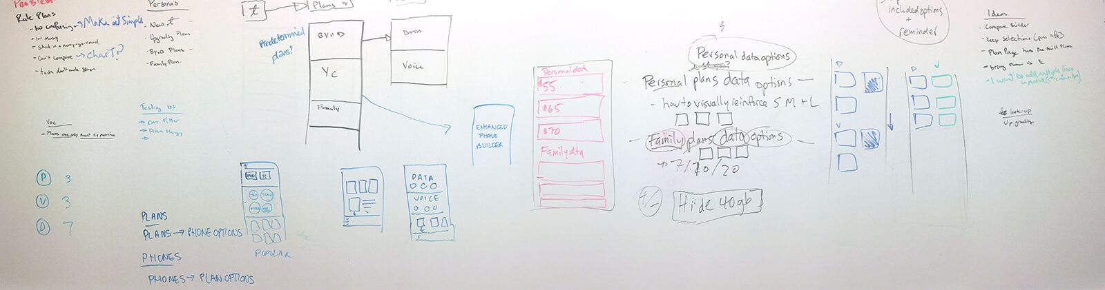
This project started with a mapping session, card sorting for page content. I started the design in the mobile view and then constructed journeys, wireframes, prototypes and design specs.
Leadership
I designed up and presented works to gain buy‐in from managers, directors and other design team members throughout the project lifecycle. Working closely mentoring my intern we shared ideas on the final visual design\
The Challenge
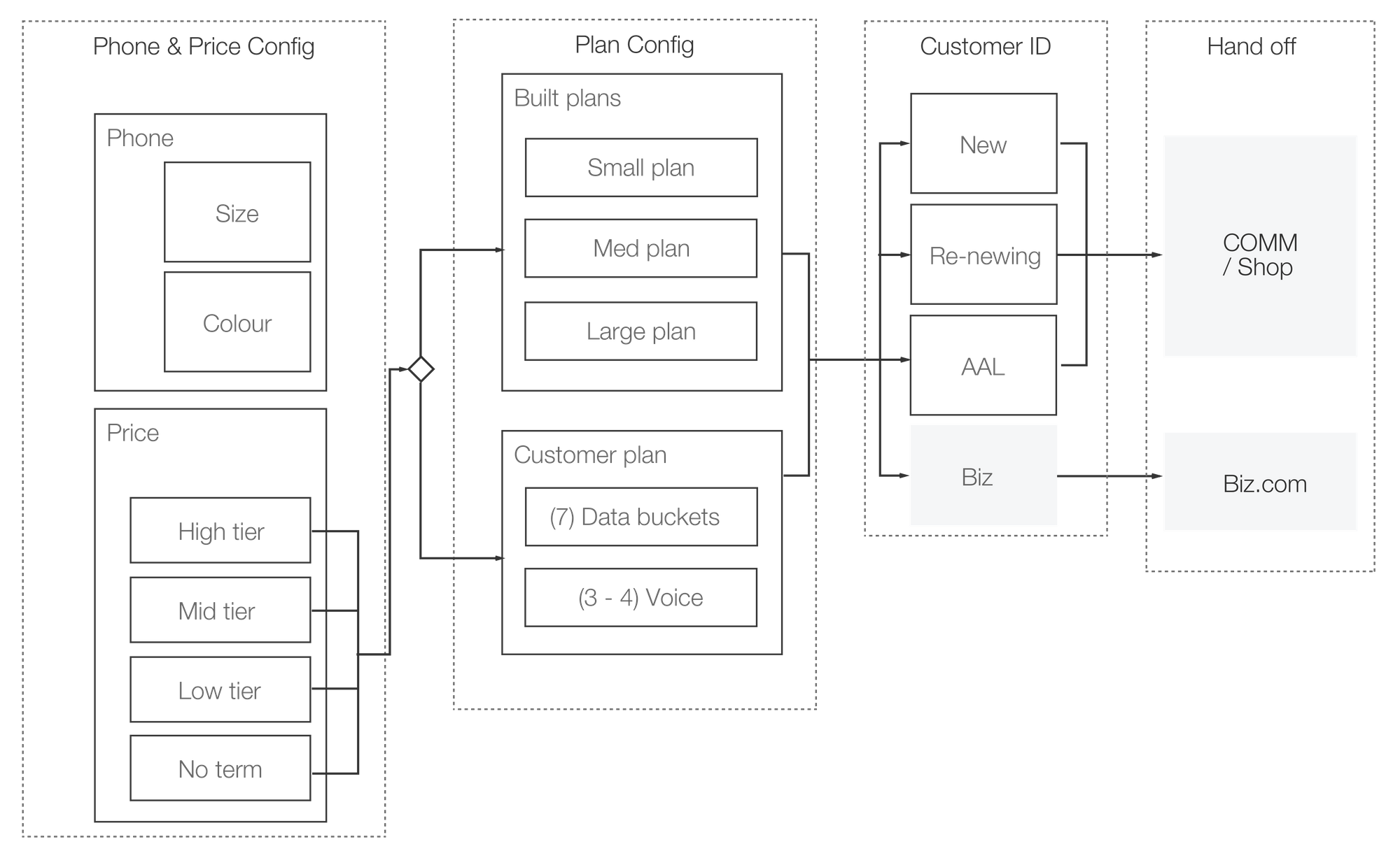
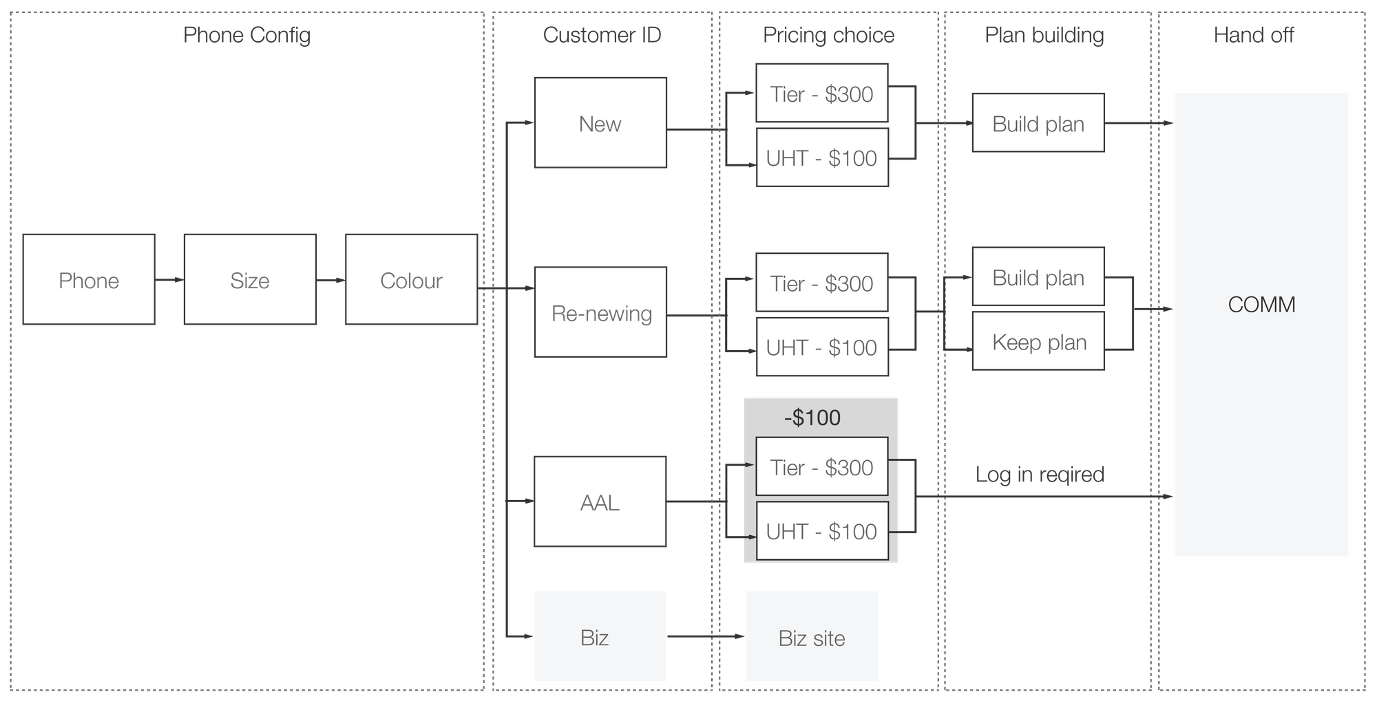
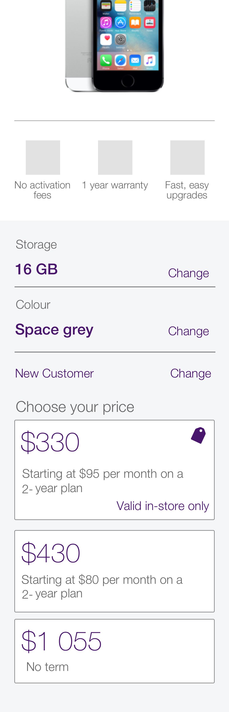
This project had many moving pieces and a lot of complexity to worry out. We needed to make buying a phone with multiple price points, storage sizes, plan options and customer types simple.
Key Performance Indicators
Success for this project was measured by the amount of new customer we were able to funnel into the commerce flow. Followed by the increase of interaction with the module and reduction of bounce rate.
The focus
For start of this project we focused on the pricing lockup, allowing customers to seamlessly configure their phone.
Detailed Design
This is … HERMAN. Explore the images below to see the latest design of the product page.
Setting the design direction
Through a top-down approach to define the overall structure of the experience, I sketched and storyboarded ideas about the arrangement of the user interface. Starting broad helped our vision to evolve into something tangible.
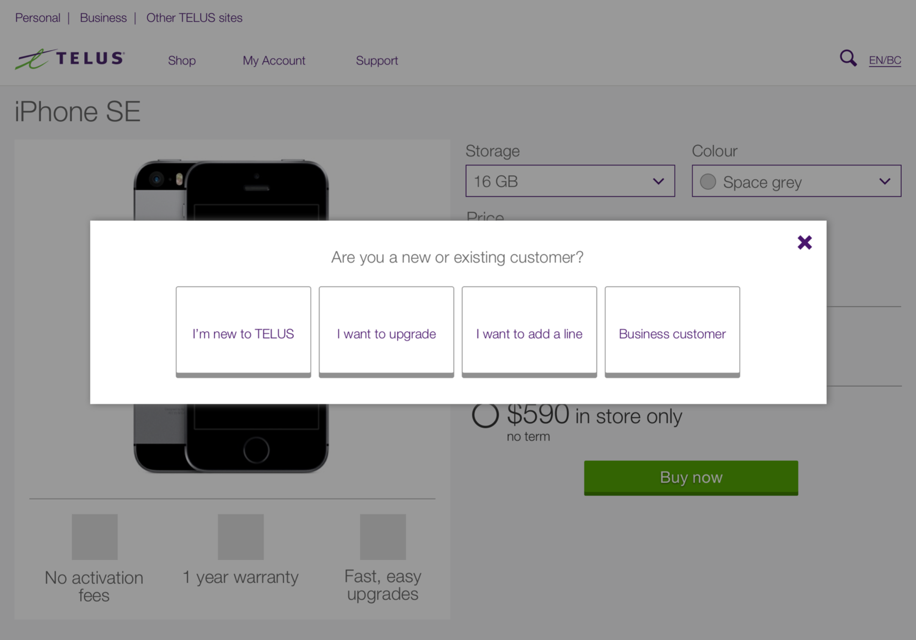
Sprint 0 – THE BASELINE
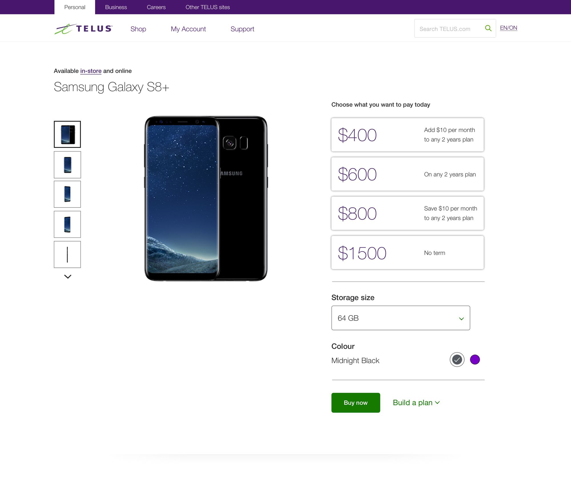
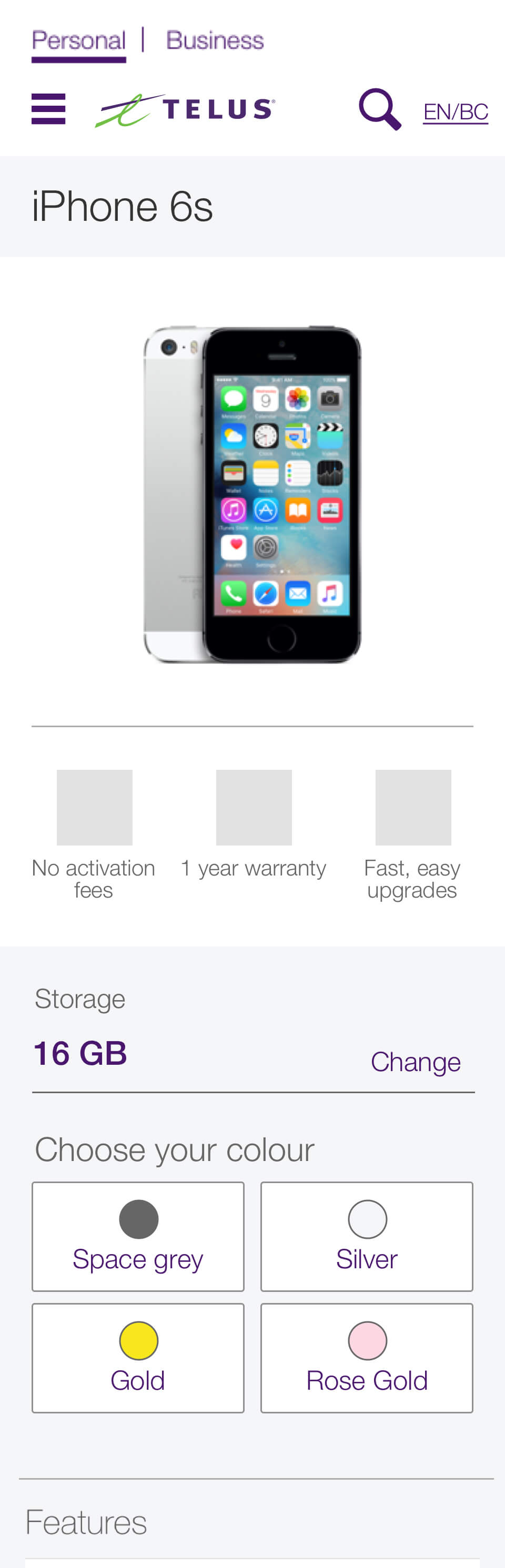
The original product page price lock up, our customers said was confusing and didn’t support multiple price points. Analytics uncovered that customers where not identify who they were, nor did they read any of the copy.
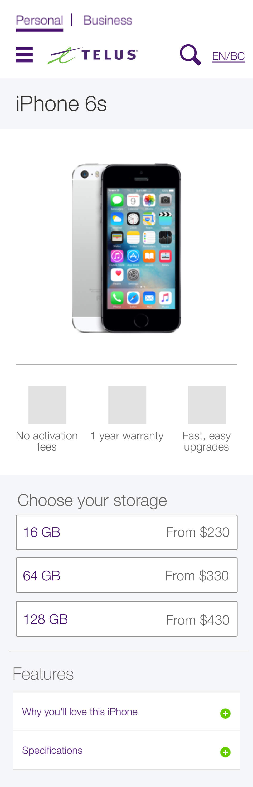
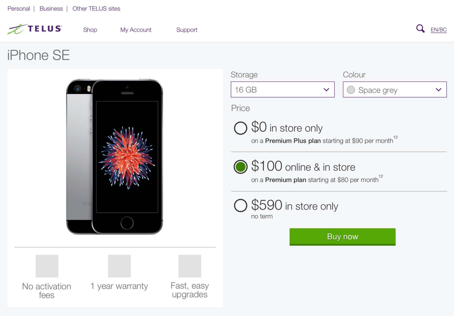
Sprint 1 – The progressive reveal
We favoured showing each section in small bite-sized chunks to allow the customer to focus on the task at hand and read the content of the page.
This proved to work in user testing, but when it live however not enough customers didn’t interact with lock-up. Those who did entered the commerce flow and completed the flow.
View the prototype
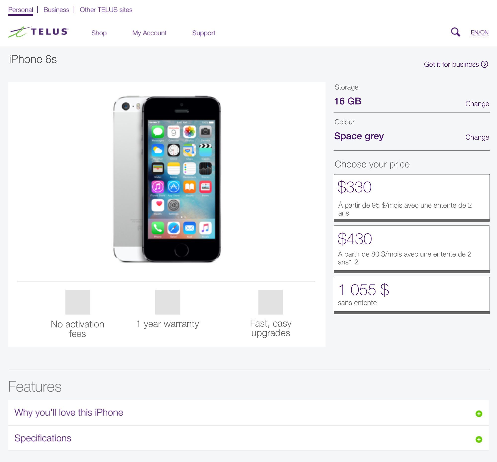
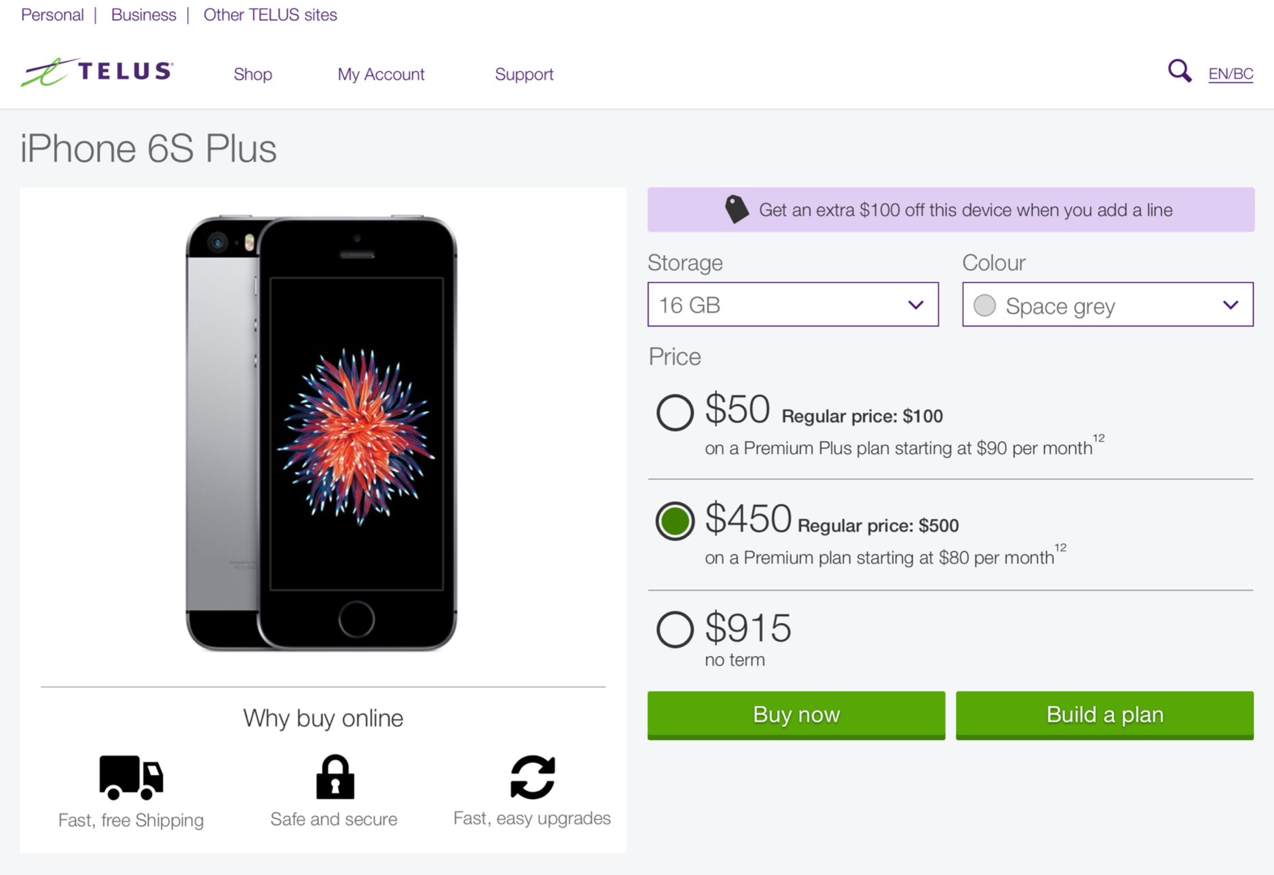
Sprint 2 – Fast follow
A week later we released a fix, after digging into the analytics from the first iteration and we made the interactive element look more like buttons, we believed that if the elements looked more like buttons customers had more of an affinity to click them. This proved to be correct.
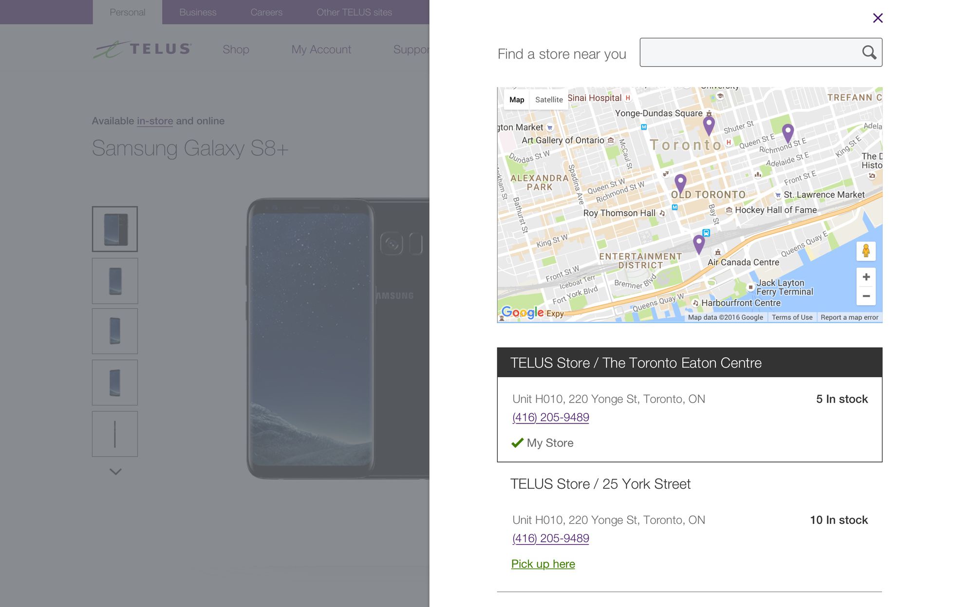
Following this iteration the business launched their new plan and price point. The page performed well, unfortunately, the new plan and price were available in-store only. So this increased out bounce rate and drove more traffic to the find a store page.

Sprint 3 – The billboard
Receiving feedback from our internal partners, we need to pivot and quickly iterate to be able to show prices on page load. This concept ran in an A/B test against the Quick fix. The results of the test show very little change only with an increased bounce rate. We hypothesized that the customers saw the prices they wanted and then either got all the information they needed or knew where their closest store was.
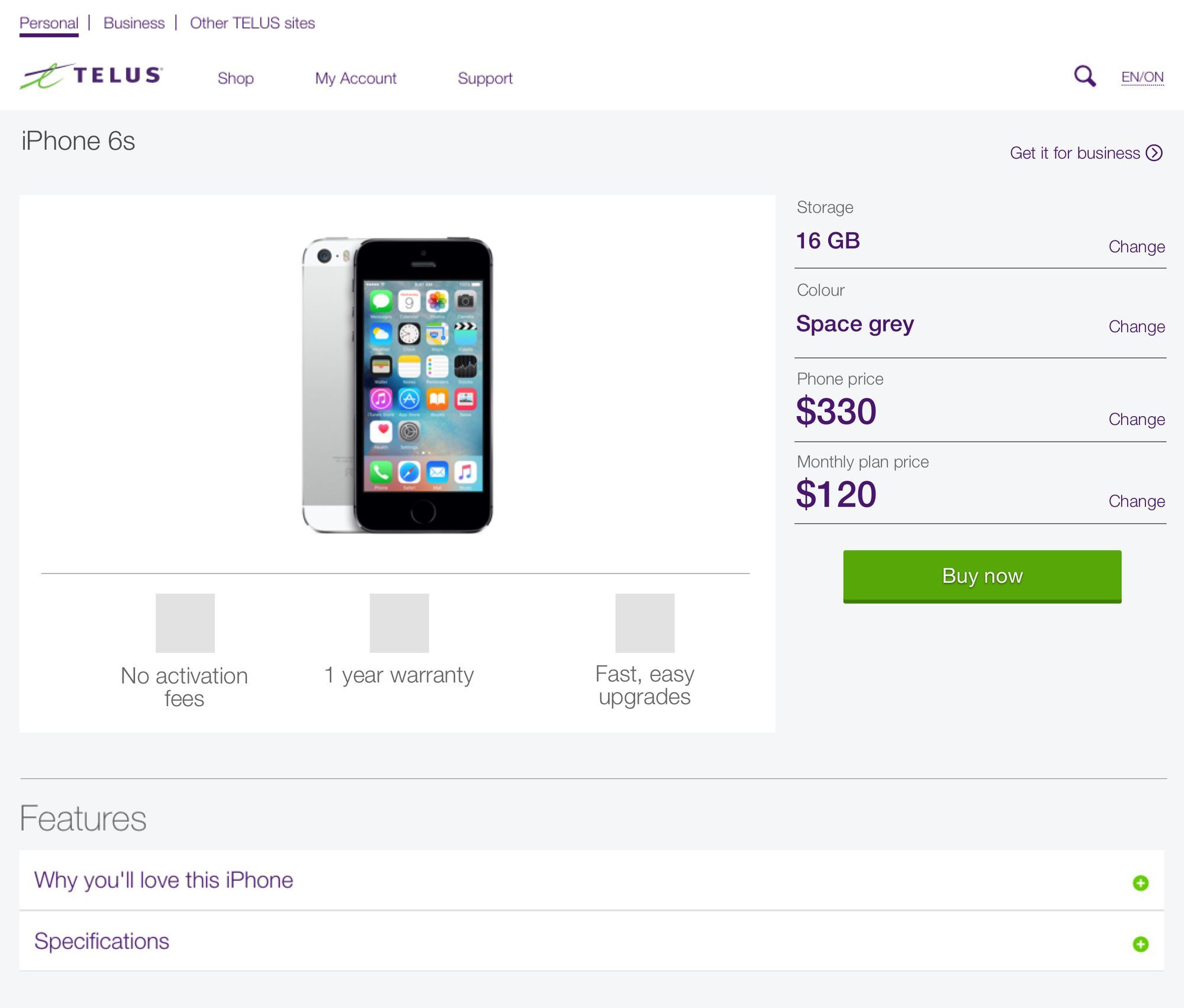
Sprint 4 – All out in the open
Hot off the heals of the billboard, not being the most elegant design. We wanted to take the learning from the progressive reveal model of the original iteration, but show the multiple price points on page load. Allowing the customer to focus on the more complex action. This also allowed up to decouple the customer selection and move it to the end of the flow.
From our research we favoured drop downs for elements with multiple selections like colour and storage size.
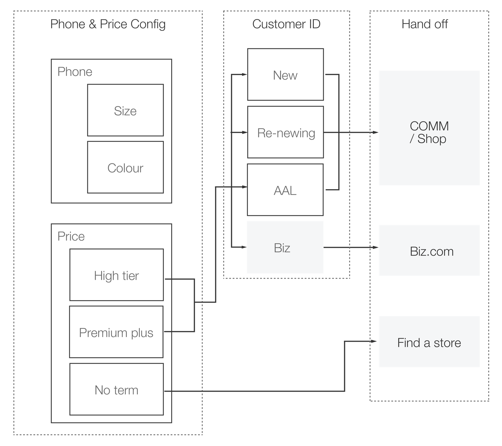
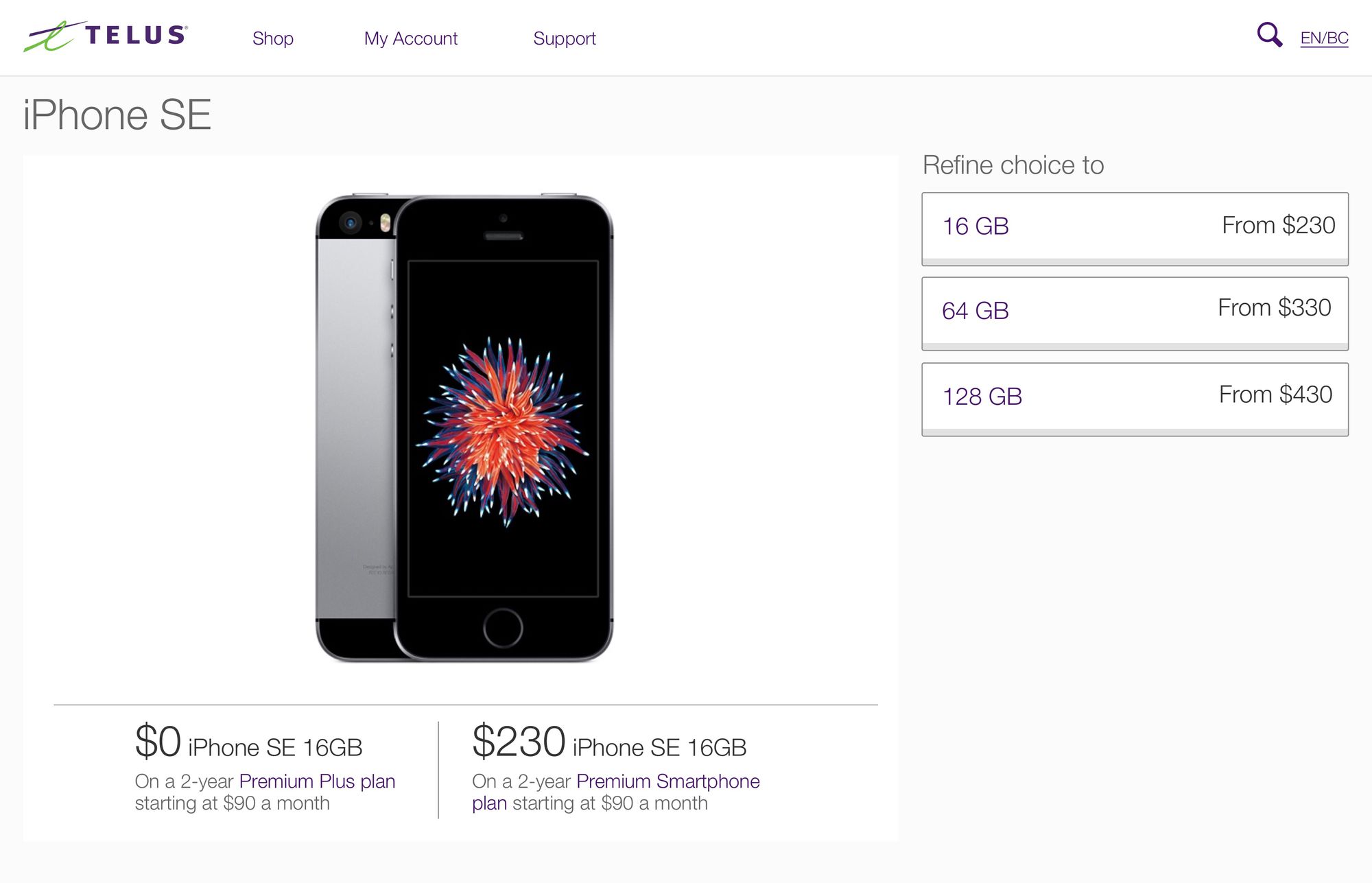
Sprint 5 – Always have a plan
The new layout merged design and business goals. It had the lowest of the bounce rates, fewer people exiting to the find a store page and better-equipped customers into our commerce flow. Which allowed us to move forward to the next iteration of allowing customers to pick or configure a plan when the pick their phone.
TL;DR
Senior designer, ran workshops, helped with wireframing and over saw the project with a small team. It ended up being a 4 page site. Challeneged current web design, by having limited images. The site suprisingly tested posivitly during usability sessions and was well recived on twitter.
OTHER CASES
Have a look at some of these other projects