H&M Global Checkout
This was a labour of love. The Journey of how we increased the conversion by 4%.
Background
A perfect storm was brewing at H&M when the features for checkout were growing but so was the technical and design debt. Also changing from waterfall delivery to agile we needed to find a way to support it!
My role
Over the 2 years, I lead the Checkout design team of 3 fantastic designers across the web, app and in-store applications. I facilitated design sprints and laid the groundwork for the projects enabling new designers to take over and iterate.
Leadership
I balanced design resources to support the 8 product team. Constantly played a servant leadership role, striving to challenge and support the designers working the team to drive the vision of the new checkout. While working with our Product Area Manager and Product Area Lead Engineer to meet our OKRs (Objective Key Results) for the area.
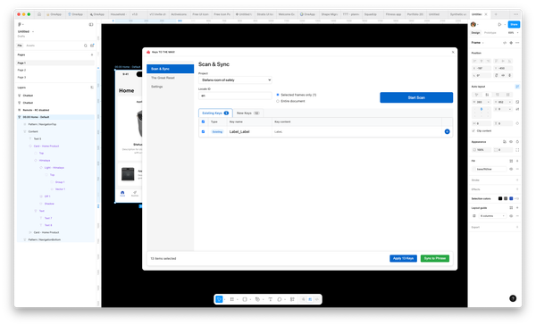
Secured design standards in Abstract and in Sketch for easier collaboration and onboard new designers.
The Challenge
When taking over the product area, I faced a few challenges. First, there was no previous documentation on what design decisions were made and why. The data we had was very binary — we could tell if a user completed the checkout but if they did complete, we couldn't pinpoint if were dropped off was. Our data in click-tale only help the last 90 days and in select markets. It was also difficult to do any A/B tests and get clean data due to the number of bugs that kept creeping up.
The problem
With the challenges above we need to support a few new initiatives. First, the backend infrastructure was being rebuilt to support APIs. Then, moving from web-views to native in our app checkout. And lastly supporting - how we can orchestrate orders from multiple vendors or warehouses.
KPIs
Increase conversion rate, reduce the amount of time it takes for a new customer to checkout and reduces the cognitive load on our users.
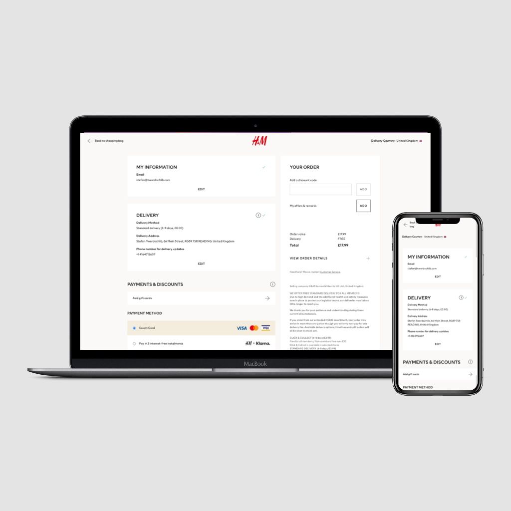
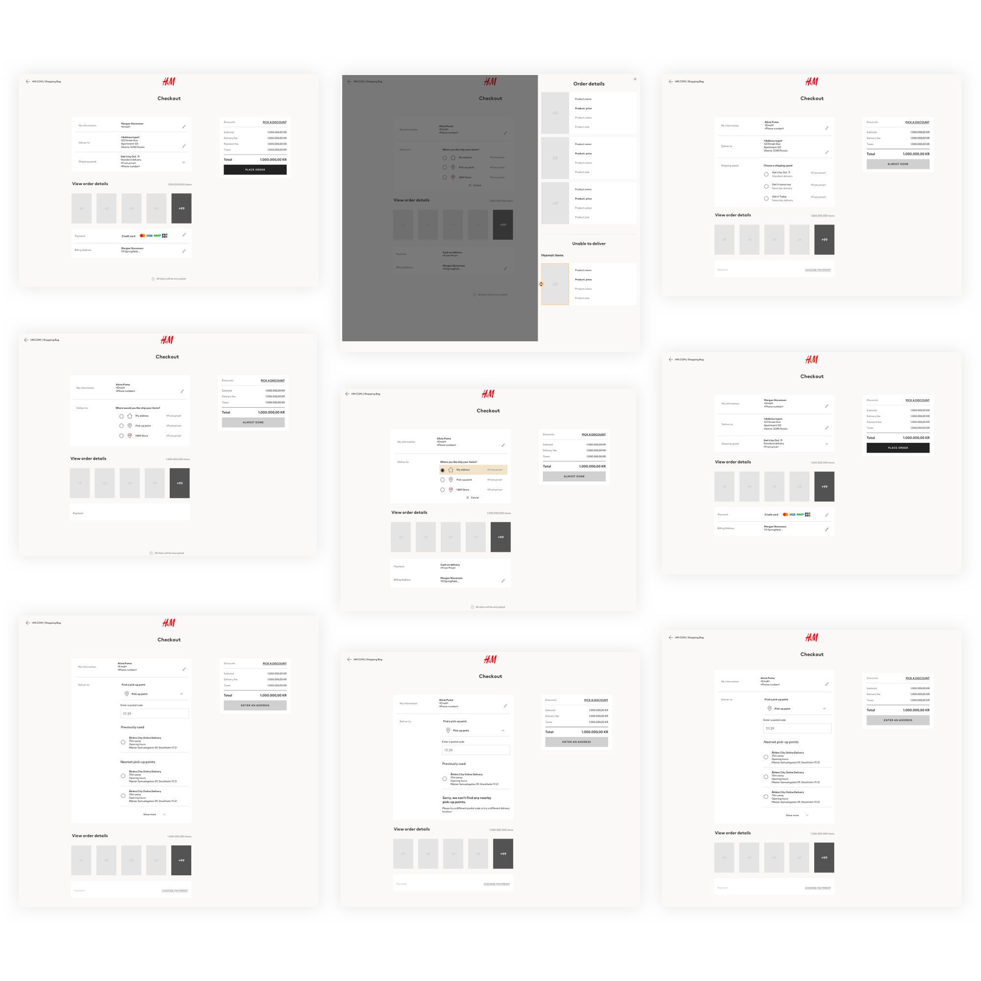
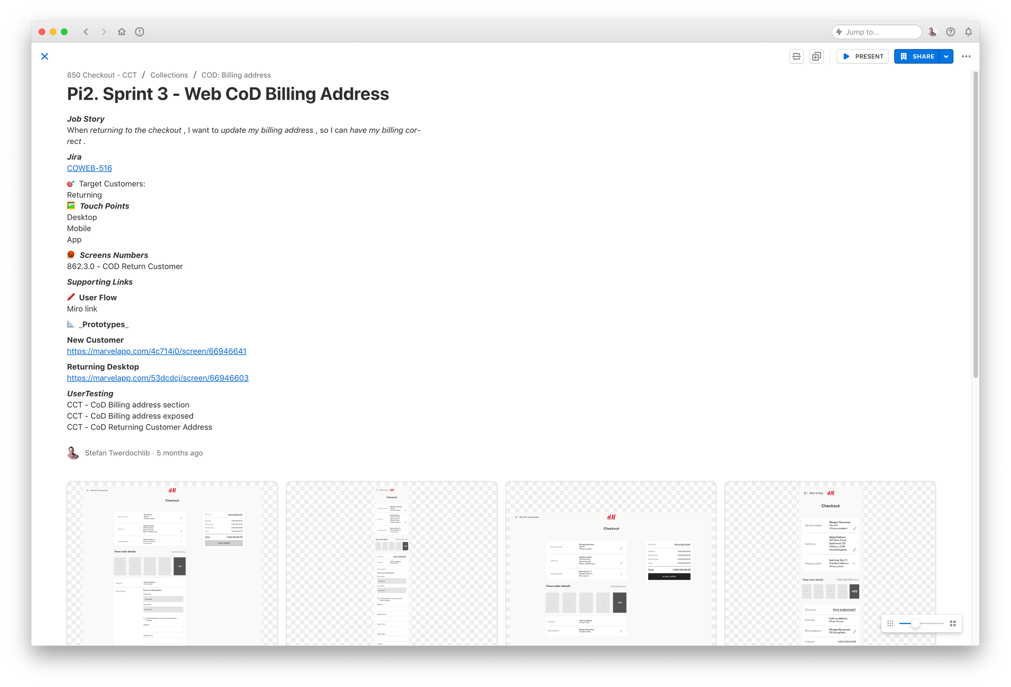
The final design
After a few months of work, we finally launched in Russia on the app and web.
How we got here
Strategy & Vision
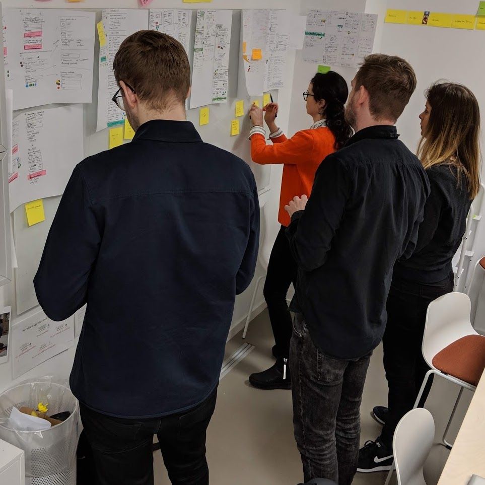
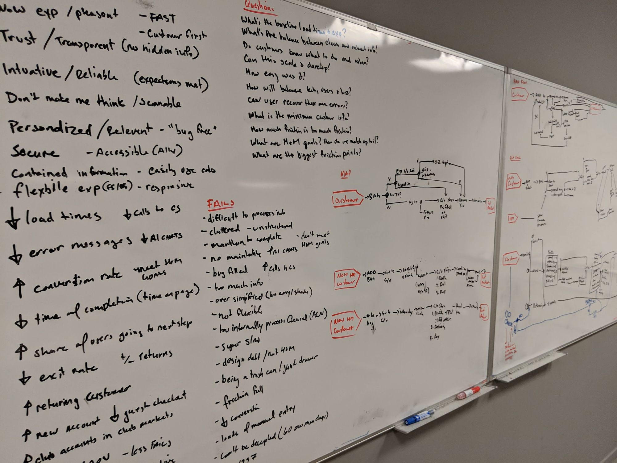
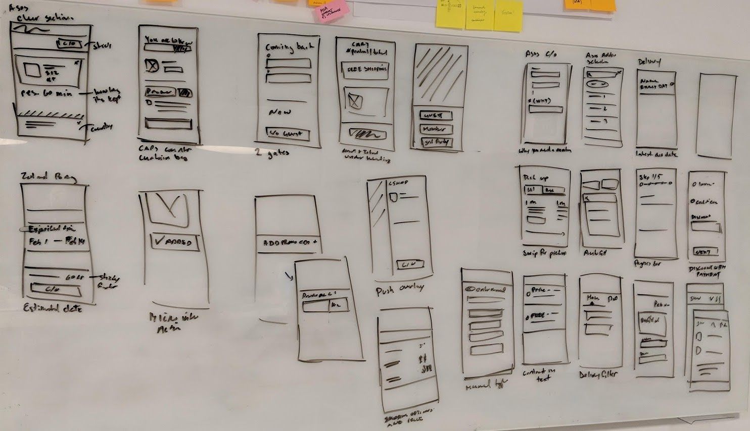
Being new to the organization and raking over the product team. I needed a quick way to understand who our stakeholders were, their needs and what features are coming up that that need to support. But also quick check under the hood of how things work. To do this I facilitated a couple of design sprints. Allow us to all be on the same path forward, and align on our vision..
Checkout Vision Design Sprint
My Role
For this sprint, I facilitated, created prototypes and conducted usability testing.
Highlights
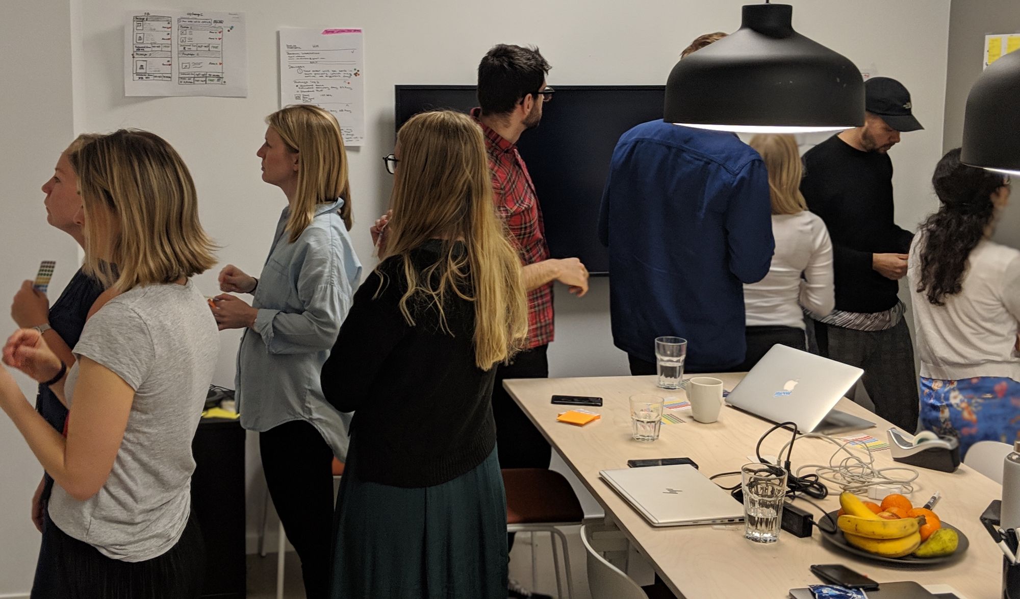
To get the lay of the land quicker, I gathered our stakeholders and designers together for our first design sprint. This followed the 5 day GV Design sprint methodology. This sprint's focused on where do we want the checkout to be, and drive the vision.
Through the sprint process, it helps to see we needed to test 2 white-labelled prototypes. One used a long scroll and had all the information a customer needs to be filled in the present. The other used progressive reveal to show the user relevant information in sections.
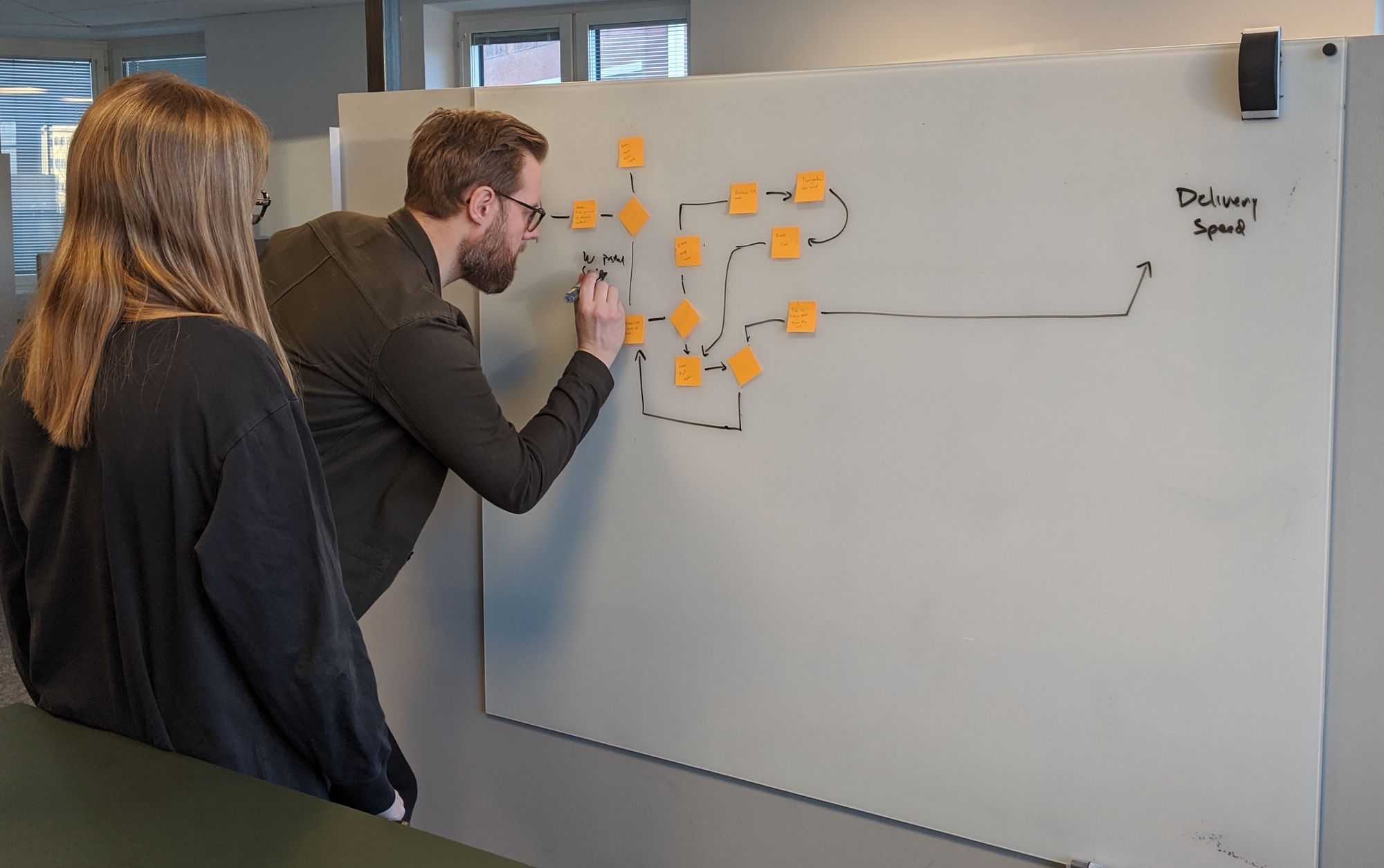
Order Orchestration Design Sprint
My Role
For this sprint, I was a coach, participant, created prototypes and conducted usability testing.
Highlights
I took a back seat and supported Martin Lechev facilitating debut. Pre sprint I coached him through the process and was there as a support and a helping hand if we got stuck anywhere or if stakeholders got a bit too heated. He did a great job and it was a joy to observe him lead and support him along the way.
For this sprint, we focused on the problem of sending multiple packages from multiple warehouses and vendors.
We learned the current checkout we had could not support this problem. Users were too confused and unclear how and when their packages would arrive. But we did learn that they are willing to wait a little bit longer if it meant it would arrive together.
Competitors analysts & Adjacent markets
When interviewing customers or stakeholders I would always ask "Do you have a favourite checkout? And why is it your favourite?". This allowed me to see what people were thinking, and it was interesting that people could tell me checkouts they hated, but it took a little for them to think of a good checkout. Taking this knowledge I could see what people held as good, but also taking it outside of the realm of fashion to food delivery apps.
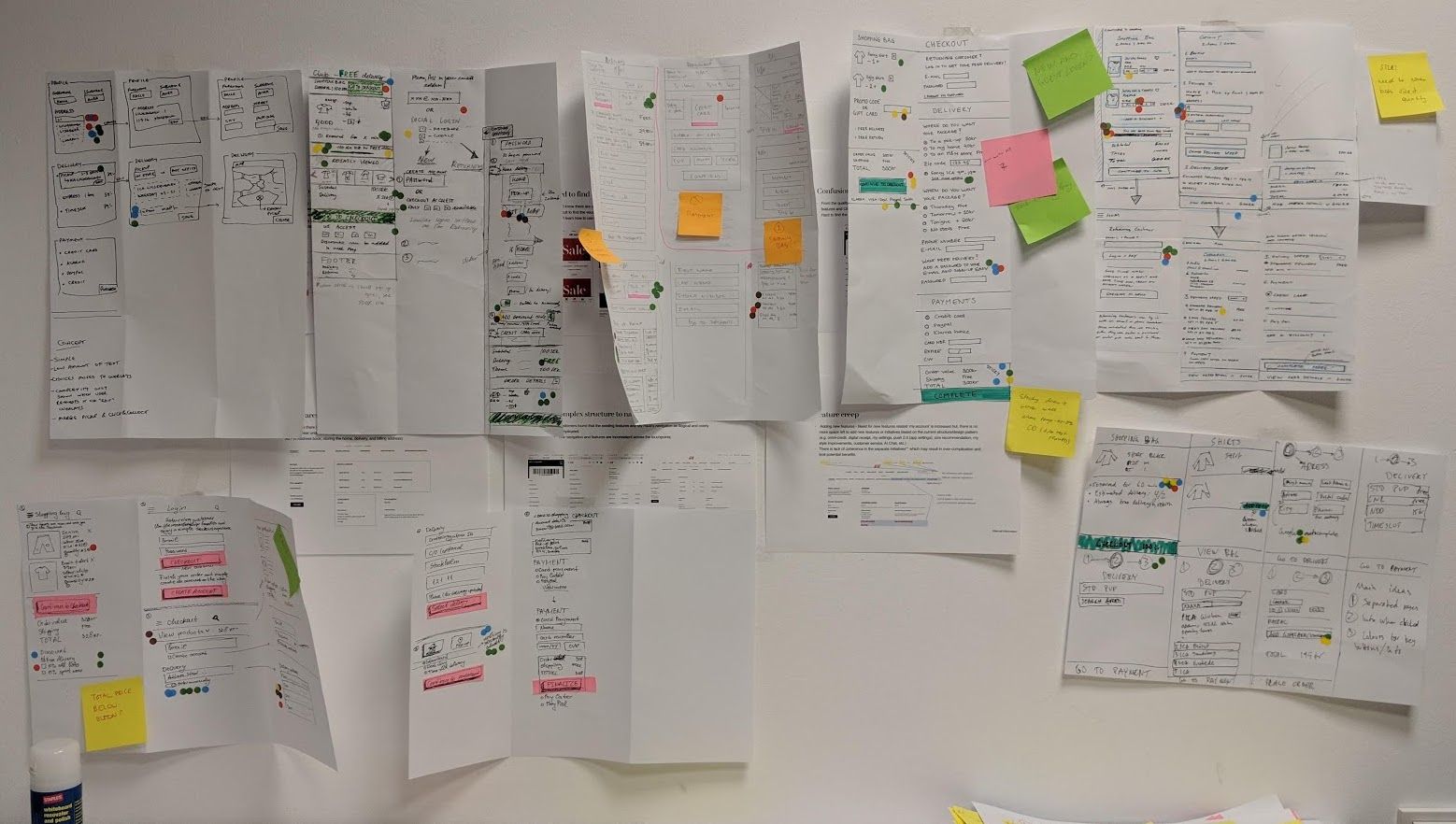
Planning & Scope Definition
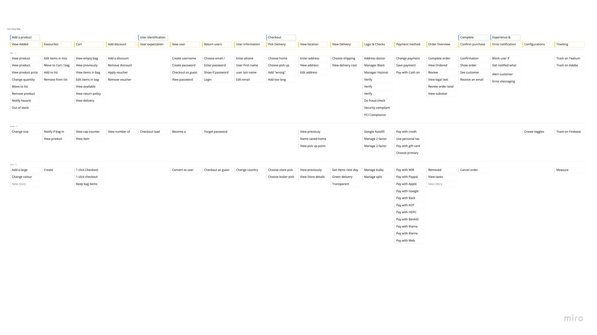
After the design sprints concluded, I ran a story mapping workshop to help identify gaps and create our MVP. This allowed us to identity which of H&M 57 markets we could launch in first.
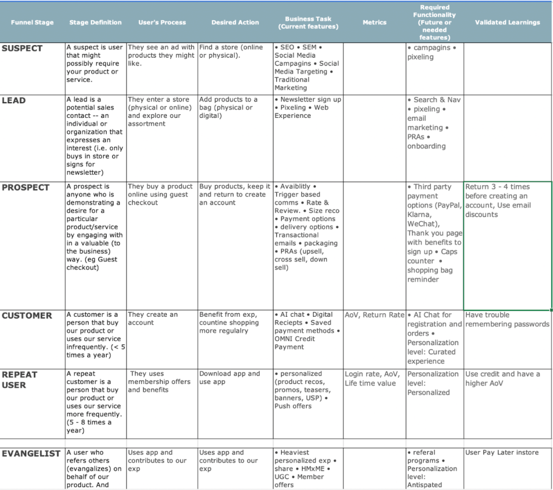
With out stakeholders I created a funnel matrix to identify who the customer segments and how were are supporting them in their lifecycle as out customer.
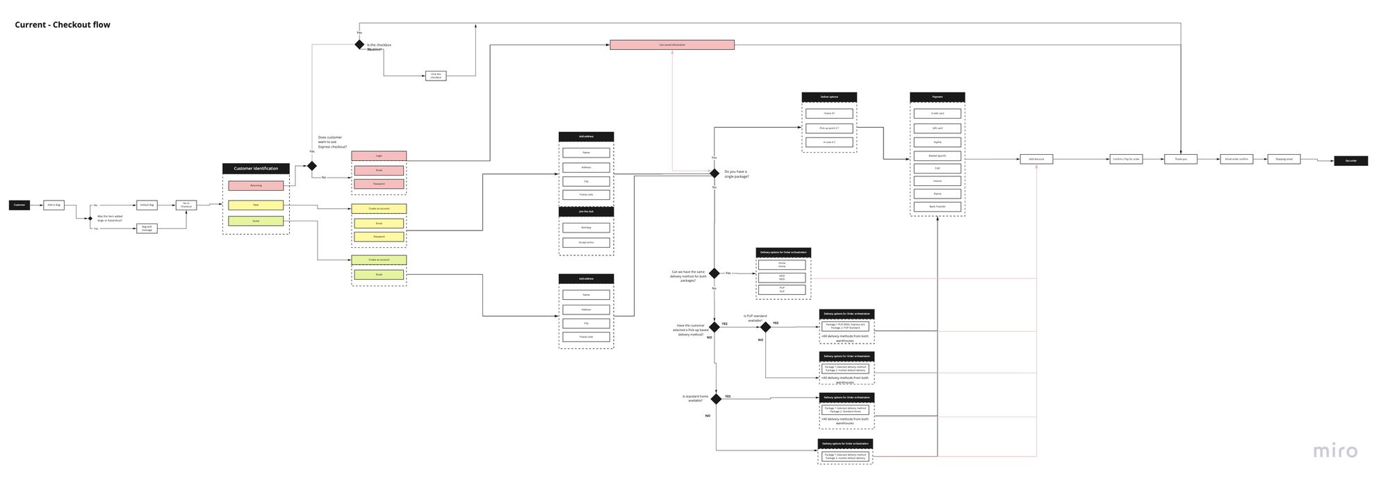
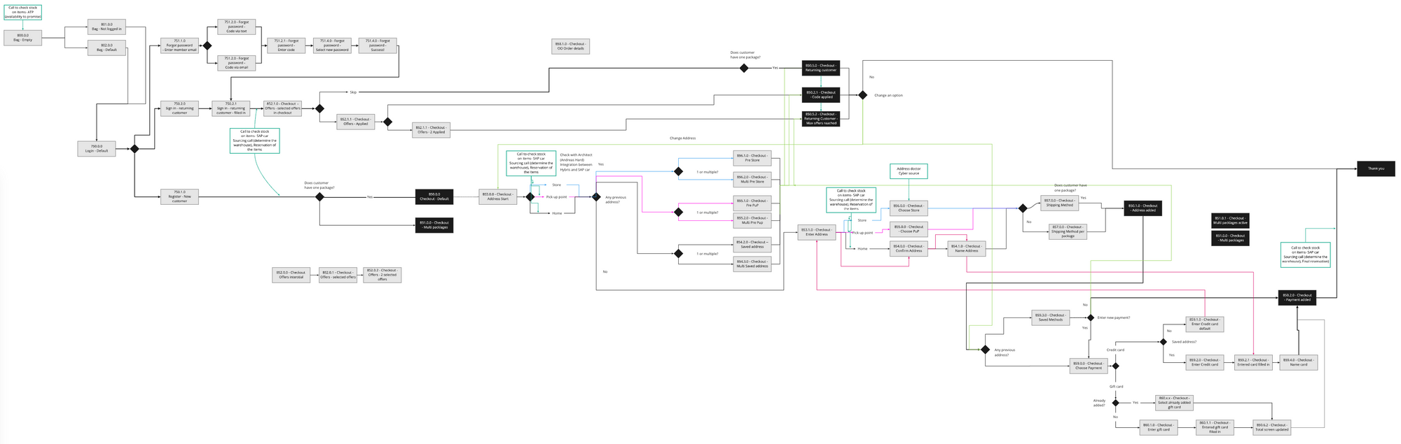
Customer Flow & Content mapping
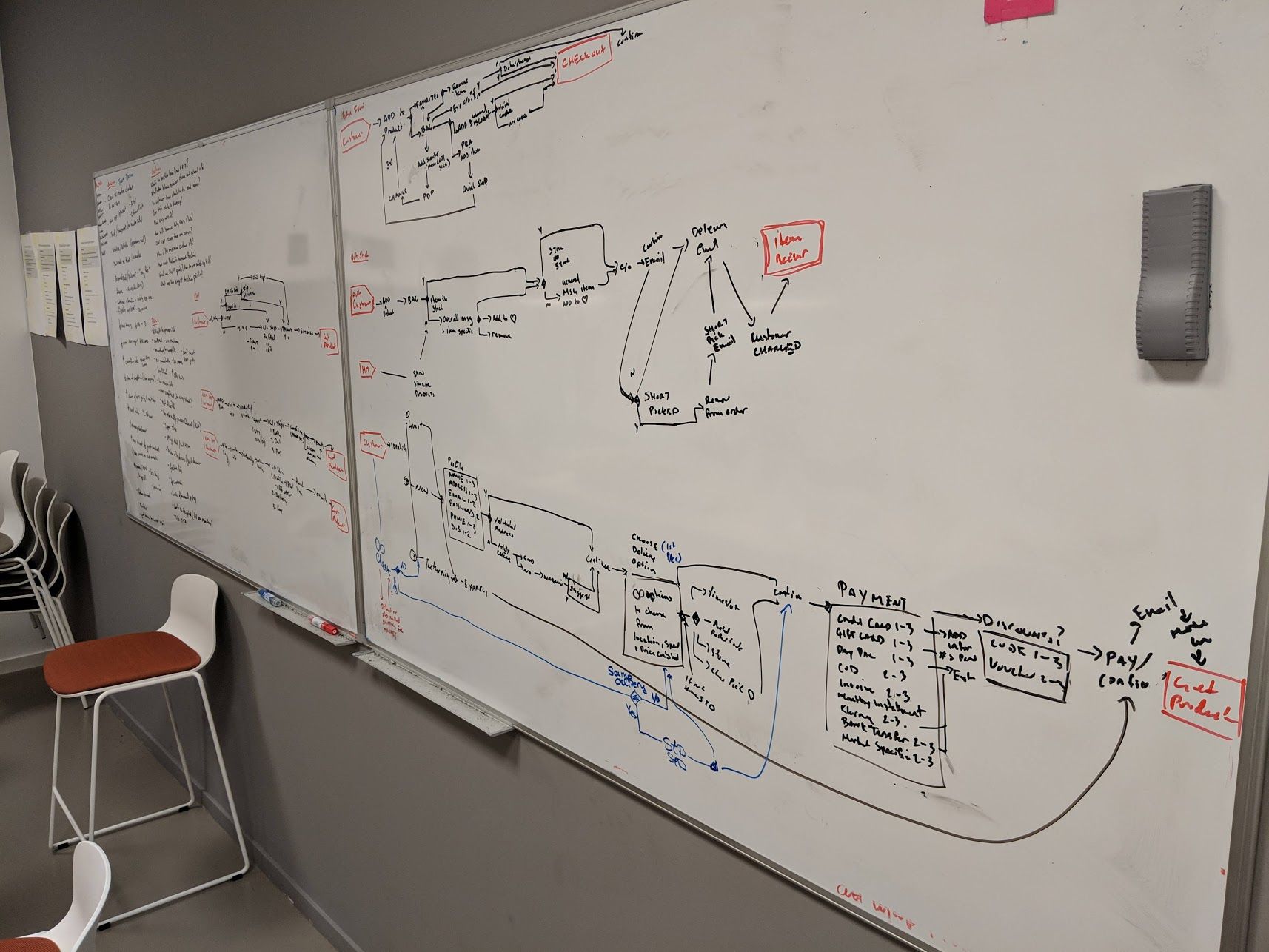
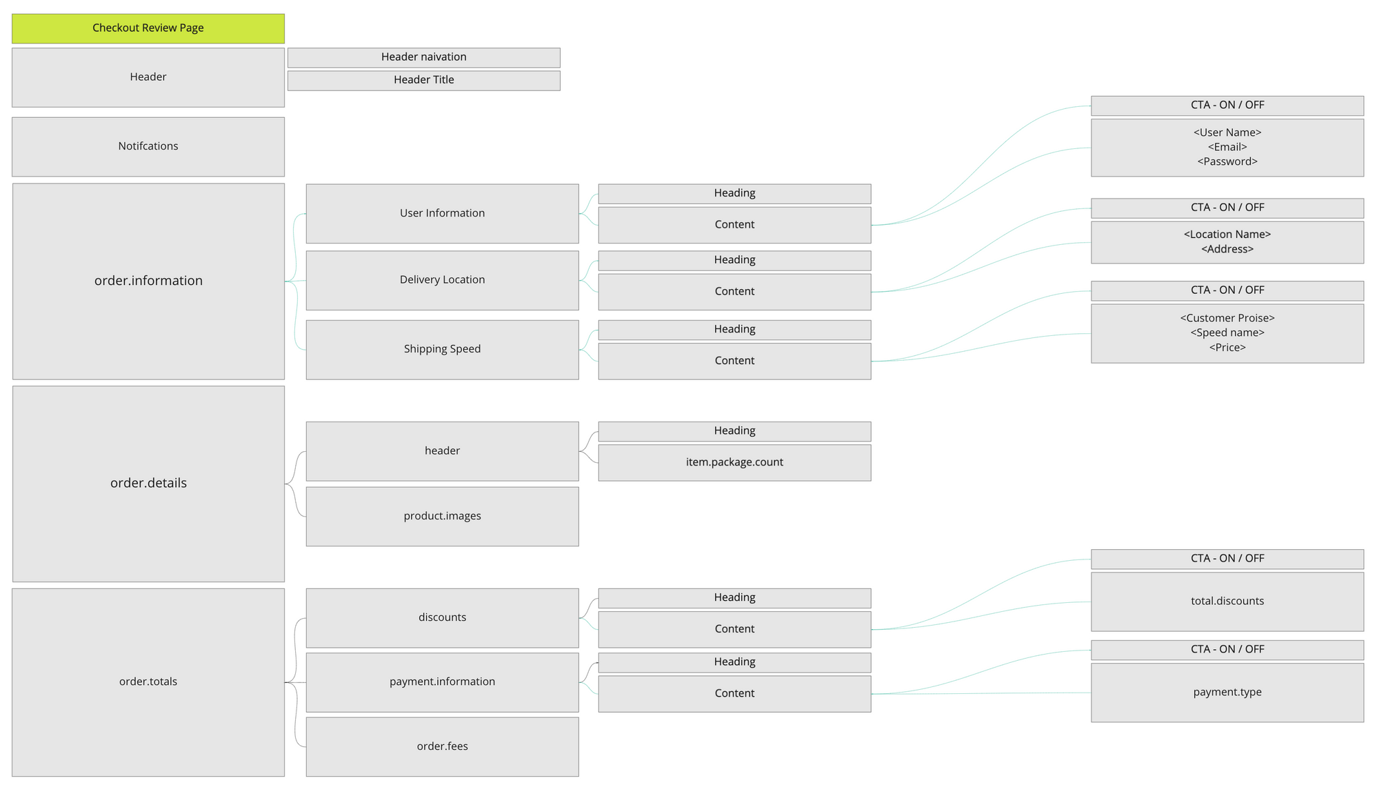
With the knowledge of all the different features that we want to create, I was able to map the full flow of the different touchpoints. Also begin to map out the content blocks for the check, know what components can be reused.
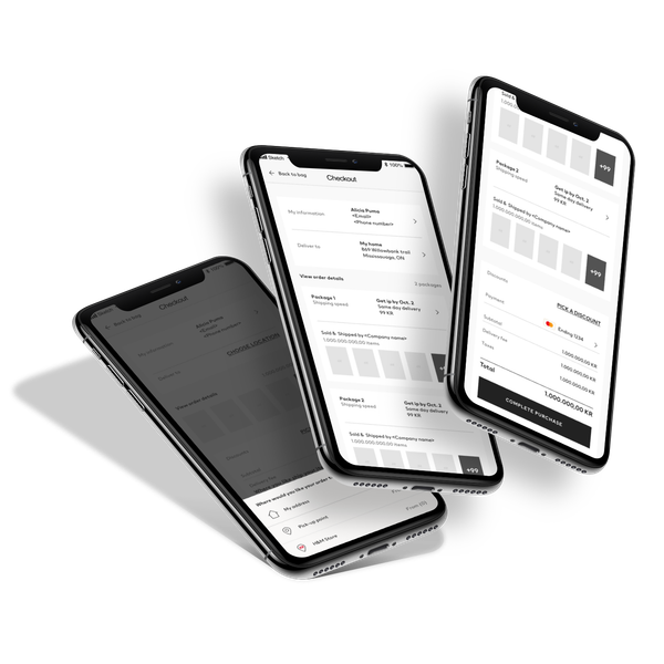
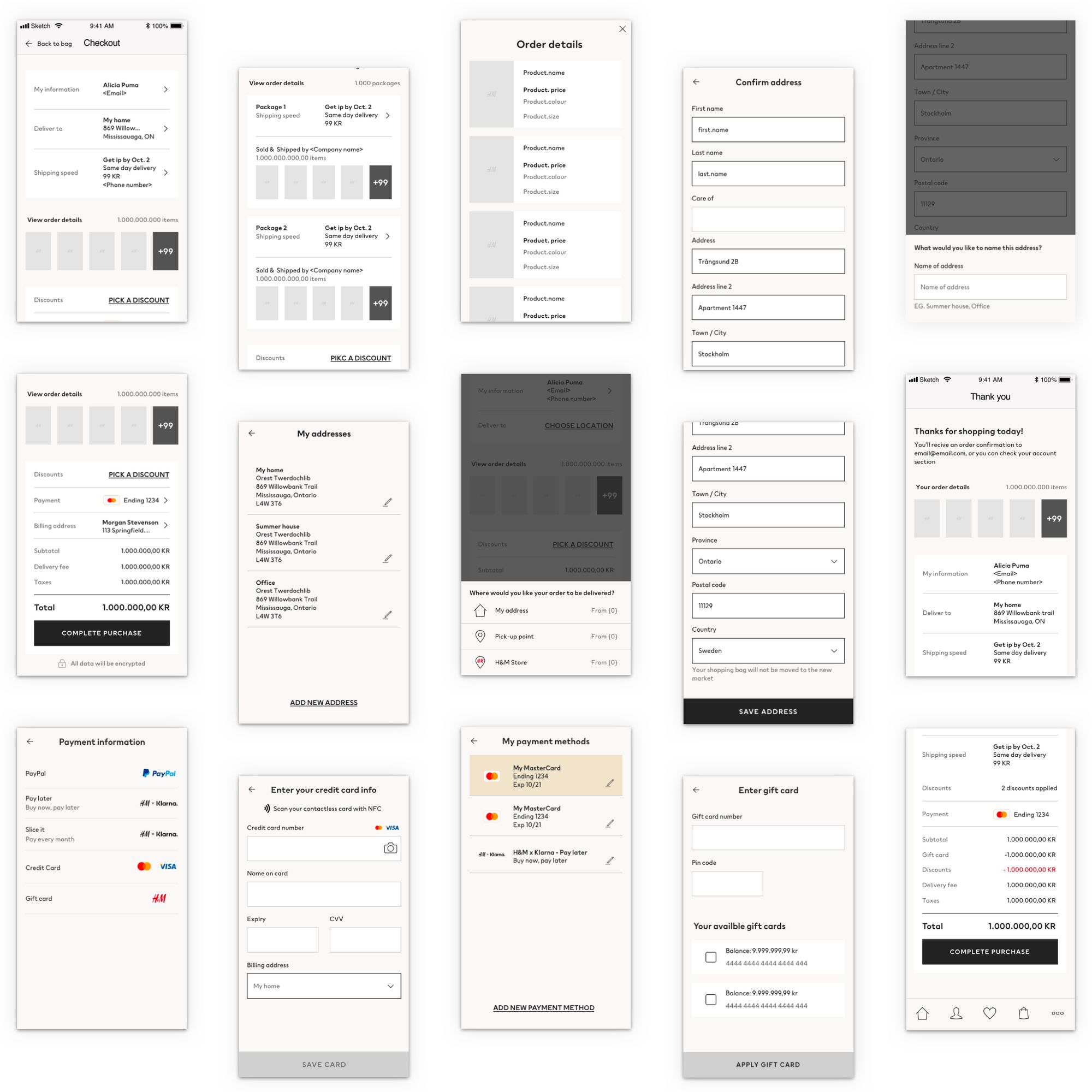
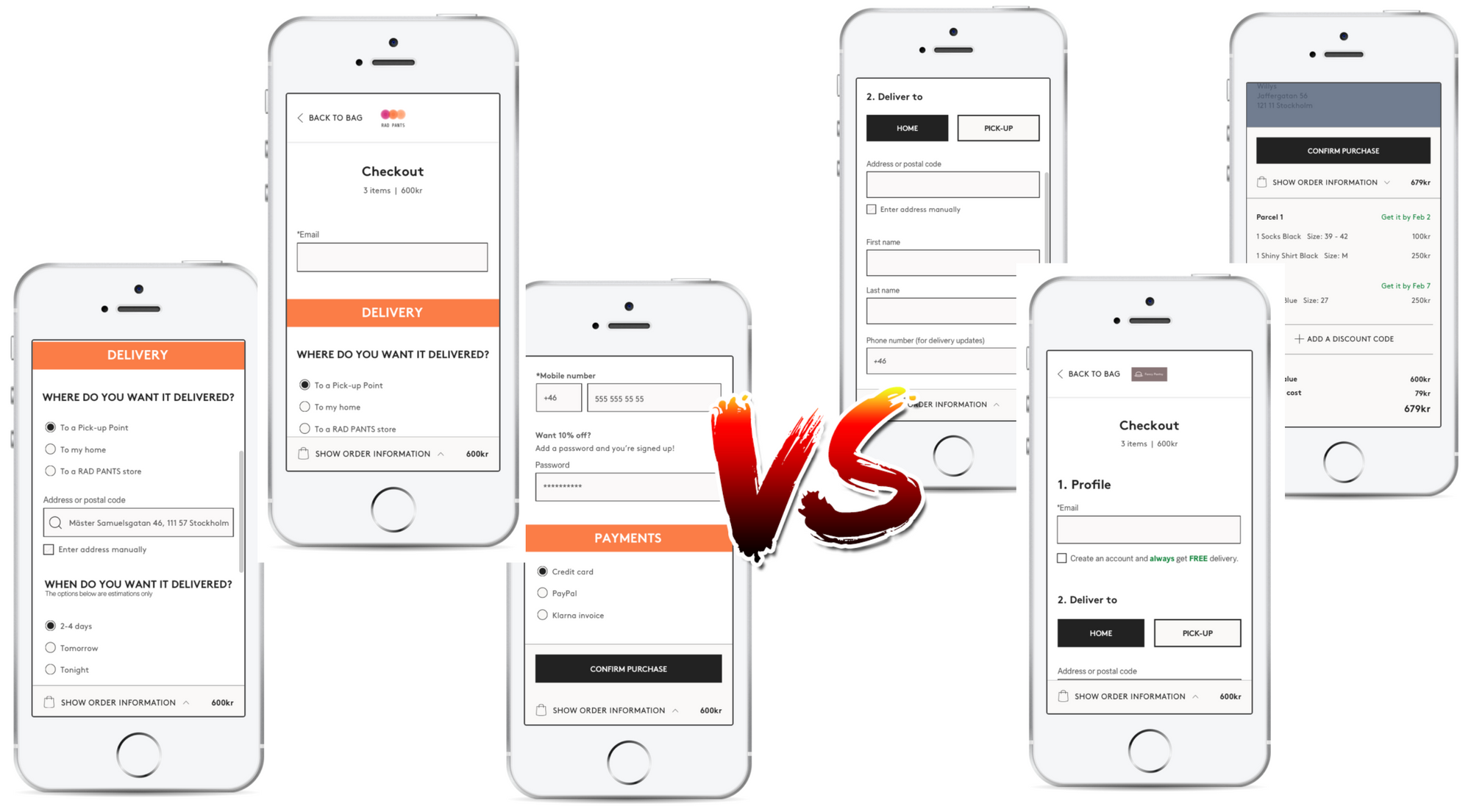
Native APP Proof of concept
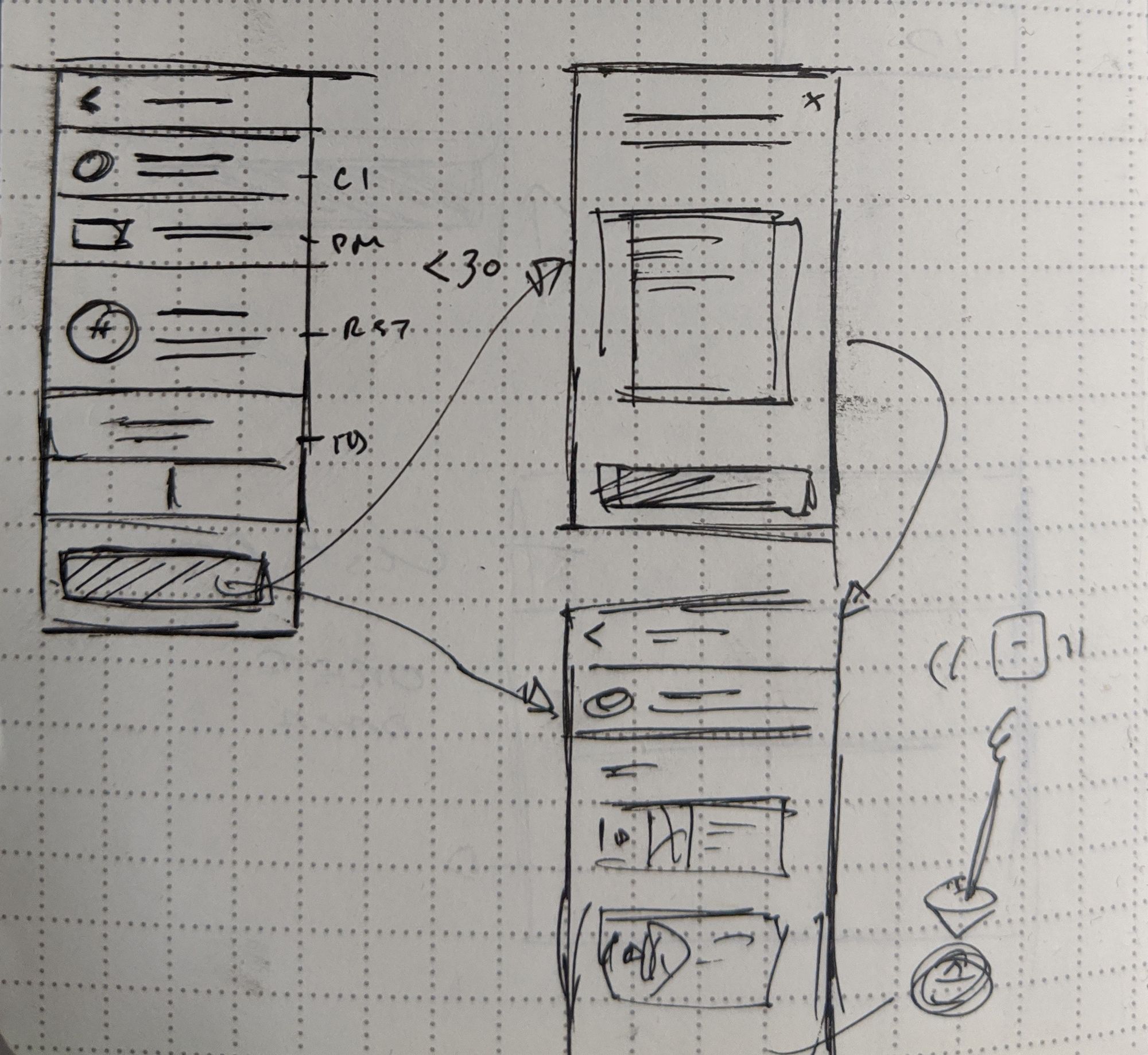
After all the design sprints I was able to jump in and prototype proof of concept for our iOS app. With inspiration from how we could show our content better on our app. I started to sketch our pages. Then working with one of my designs Andreas - we co-created in a large meeting room with a couple of stakeholders to create our proof of concept (POC) to begin testing.
This POC was a visual tool to get buy-in from our stakeholders to show what the checkout could be and how we can get there.
The Native POC
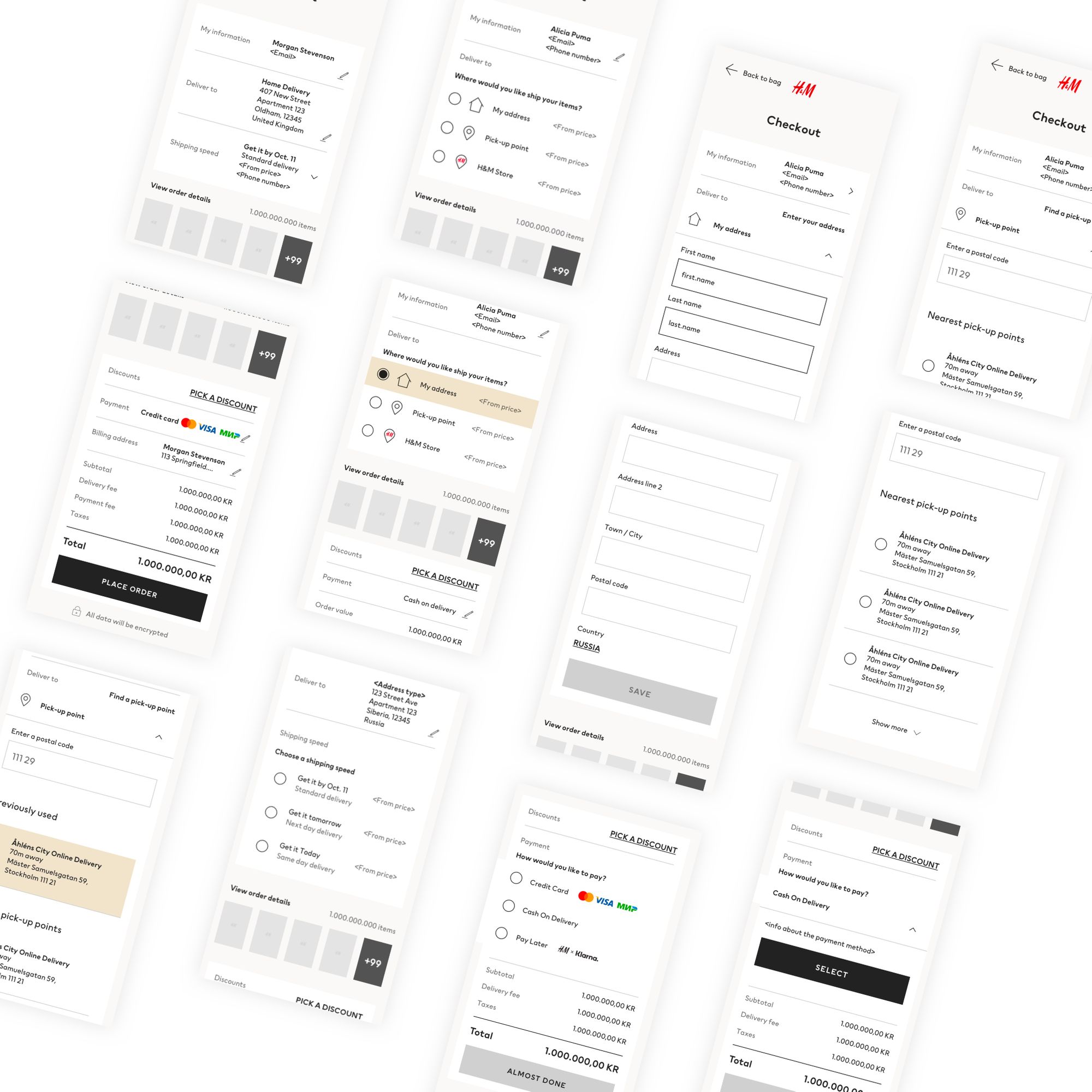
The MVP
Starting in 2019, H&M was transitioning into an agile way of working. I moved to help lead the design strategy of the checkout. I worked with a couple of new product owners (POs) to get them excited about the design and find a way we can roll it out to our 57 markets.
We used the story map to determine that Russia would be the ideal market to launch our MVP in. With the help of UserZoom, we ran 74 studies over 7 months (mixed methods like moderated testing, unmoderated usability testing, card sorting, 5-second tests and click test) getting feedback from over 1200 users to help point us in the right direction.
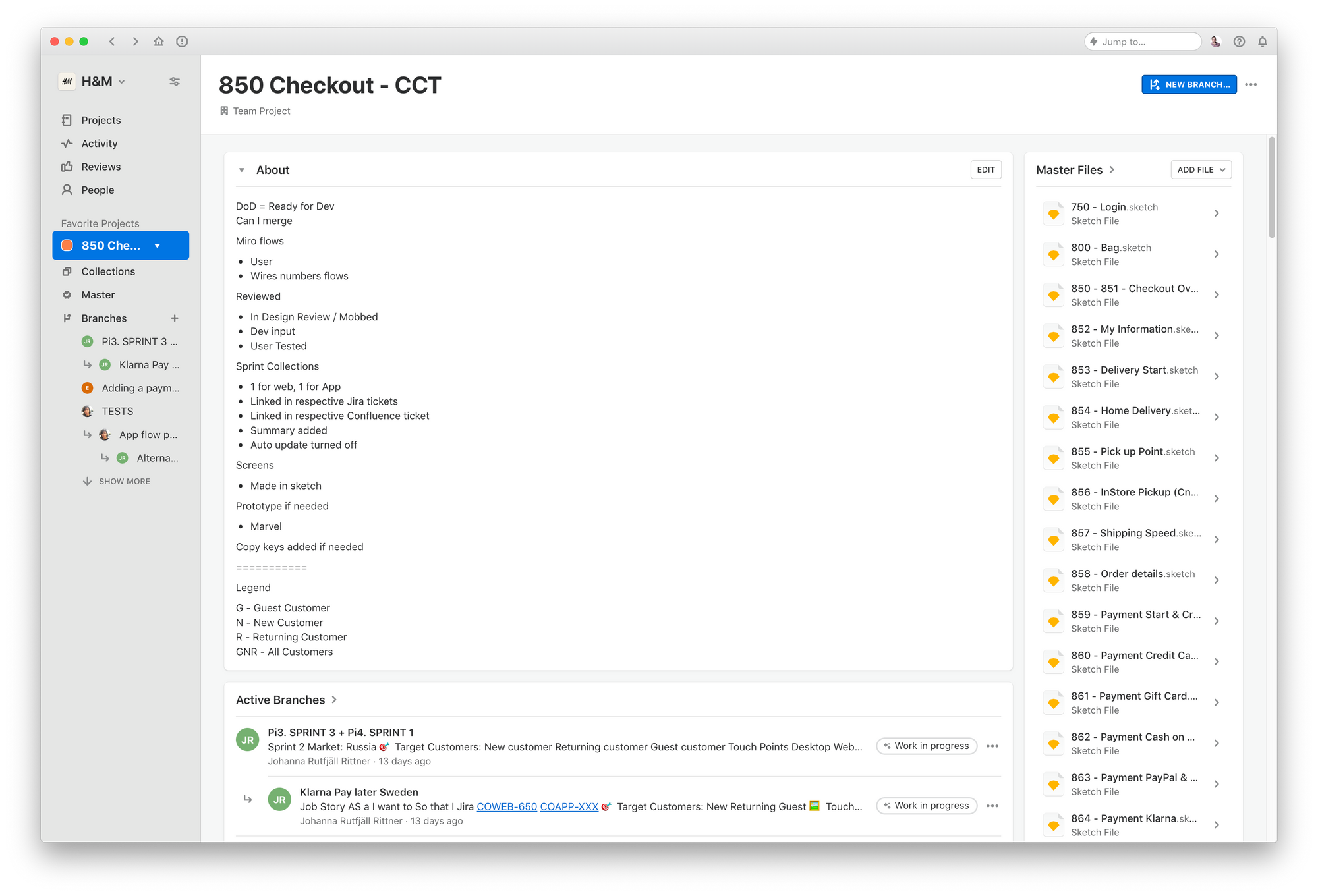
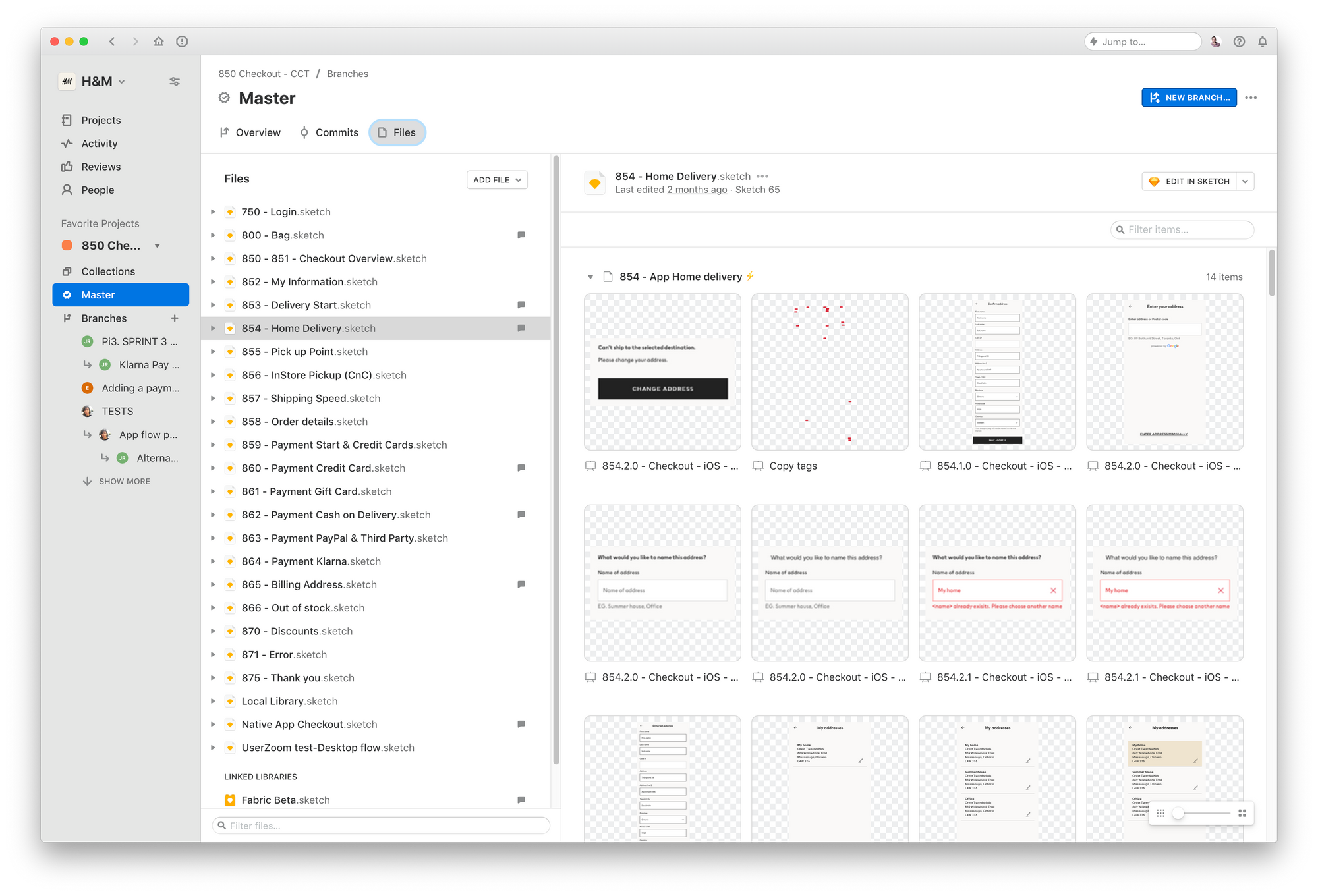
I structured our project space in Abstract and worked with our product teams on what designer handoff would look like.
Feedback & insights
No matter how long you've been working in this industry or the amount of testing you've done. It's always nerve-racking to launch a new design. We launched in April 2020, and slowly throttled the traffic of the new design to the users. In the first week, we launched to 10% of our Russian customer base and saw a small dip in the conversion (-0.05%) of the new design vs the old one. But as the weeks continued and users got more familiar with the design it performed much better as we expected outperforming the old checkout. It is now converting 3.68% higher and new customers complete the sign and checkout process 80% than before.
Lessons Learned
Lead by example. Through my time with the team, I learned the best way to change things is to be the change you want. I tried to conduct myself in a way the other designers could model themselves. And show that there's no such thing as boring/junior work (eg. File cleaning).
Consistency, not Conformity. This one of the principles I used with the team to deliver the experience across the web and app. Meaning that although apps and the web can be different, we should focus on making it feel similar so there are less surprised for the user. A good example of this was making the Address location toast bar on the app, do a similar job on the web. I modified an accordion menu on the web with a micro-interaction to still feel like a small segment menu.
TL;DR
Over 2 years lead a team of 3 designers in the checkout area. I ran design sprints, created initial designs and helped launched a new design in Russia increasing the conversion rate by 3.68%.
OTHER CASES
Have a look at some of these other projects